One Slide. One Concept.
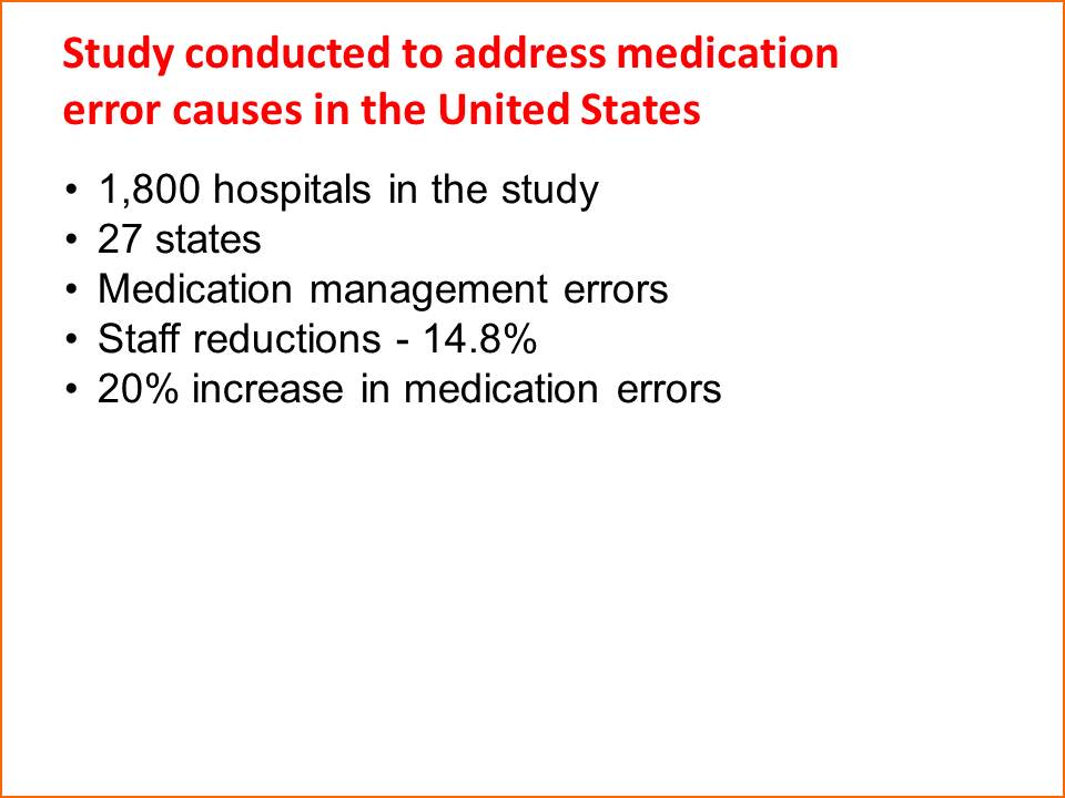
Take a look at the Before slide image here. It’s not as bad as many of the slides I’ve seen in my day. There’s a lot of white space and only a few short, succinct bullets. But as an audience member, I’m left to wonder:
“What’s so great about this information…wait, what is it? Oh yeah, some study was done and there is a list of results to consider. Are any of the results important? Or is the mere fact that a study was conducted the one key important fact I should take away from this presentation?”
My point? There are so many ideas, or concepts, on this single slide that the audience has to do a heck of a lot of work to figure what is important. So, when are they supposed to find the time to listen to the presenter?

After: Breaking multiple concepts from the "Before" slide into multiple slides, makes it easier for the audience to understand each concept -- and doesn't make the presentation longer.
Now, take a look at the After slide image. I’ve assumed that each of the facts listed in the bullet points are important and that the statistics within each bullet deserve attention. To that point, each bullet — each concept — gets its own slide. In the case, the 20% number med error number is sure to be emblazoned into the minds of the audience.
Now, who out there is itching to ask, “but won’t more slides make my presentation longer?” Quite simply, no. If you, the presenter, intended to cover each and every item on the “Before” slide (if not, then they don’t belong in the presentation), breaking up the multiple concepts into multiple slides will not only not lengthen the presentation — it will make it easy for your audience to understand your slides.
And isn’t that usually what a presentation is all about, giving the audience a better chance of remembering what you’re trying to tell them?


