Converting your text to vector graphics in PowerPoint – When text goes wrong in PowerPoint 2003
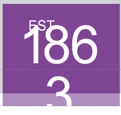
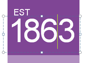
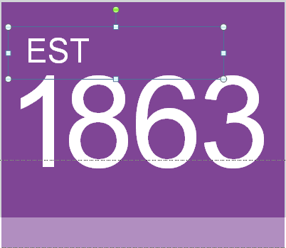
I recently ended up converting some text in a PowerPoint presentation to vector shapes after a major corporation discovered that, of the thousands of employees who were running PowerPoint 2010, there were a few stragglers on 2003 and some of the kerned text (kerned text means the spacing between letters is adjusted) was dropping to the next lined (kerning is lost in PowerPoint 2003) Figure 1 shows the original design. Figure 2 shows what happens when someone using PowerPoint 2003 opens the file.
Converting the text to vector shapes allowed us to keep the same kerning instead of forcing us to adjust it (and not look as good) for the few that were on PowerPoint 2003.
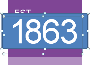
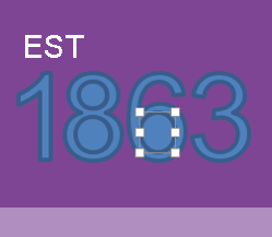
Did you know that you can use PowerPoint to create vector shapes using a built-in PowerPoint tool? It’s call Merge Shapes. Merge Shapes first showed up in PowerPoint 2010, but was brought to a new level in PowerPoint 2013 when it added the “Fragment” feature. Fragment Shapes allows up to break up text into individual vector graphics.
Here’s how.
Step 5
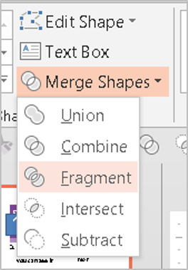
In PowerPoint 2013, go to the Drawing Tools tab in the Ribbon > Insert Shapes > Merge Shapes (More) > Fragment
Step 7
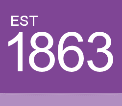
Remove the borders and change Fill color. Use Shape Union (see image in Step 5) if you want to combine each shape into a single shape
Kudos to PowerPoint MVP, Geetesh Bajaj for uncovering this little trick (little trick with enormous possibilities)!


