PowerPoint Design Trend – Supertext
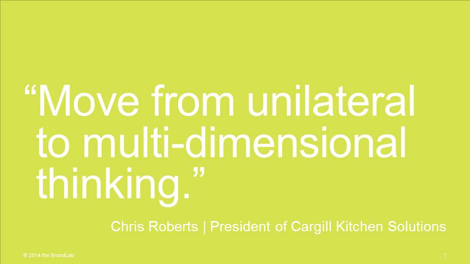
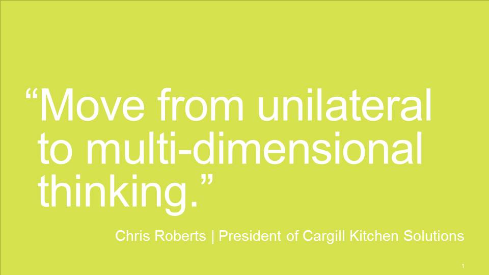
You’ll find supertext, as I call it, making the rounds in television commercials. Similarly, I’m finding — and using it — in PowerPoint design.

Designing supertext into your slide mix can result in mastery or mayhem – depending on how you use it.
Why I like it
A slide using supertext is a great tool for leveraging the “single concept per slide” guideline. As a part of a mix of well designed slides, a simple text statement can go along way in supporting a presenter’s more detailed, verbal description of a concept.
Why it could be disastrous
PowerPoint users who cannot grasp the “less is more” concept, or who are unable to write succinct thoughts without bullet points will struggle to make this work. Also, I can see slide after slide of supertext becoming as boring, tiring and irritating as PowerPoint’s notorious bulleted slides.
Take away
Use it. Judiciously.


